Better, Bitter, Butter
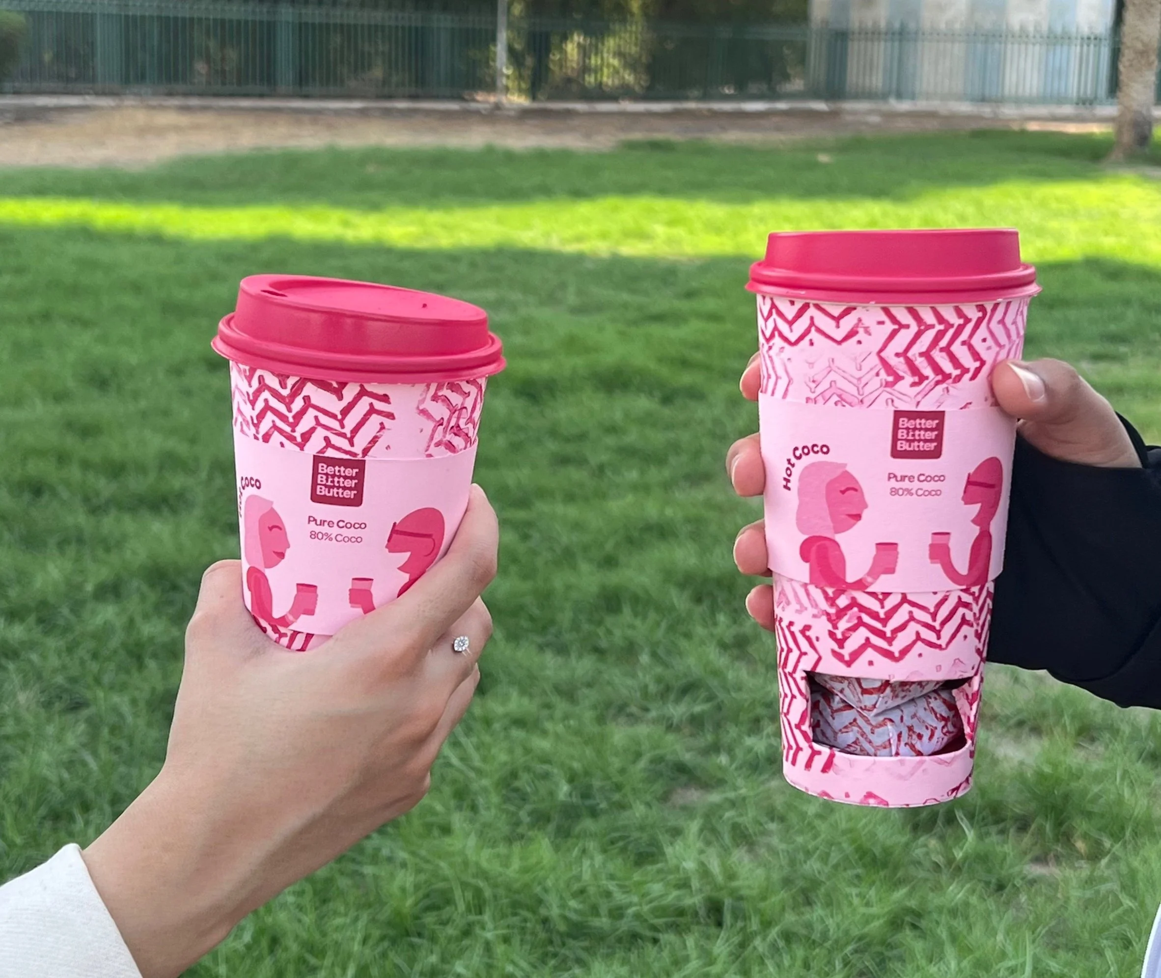
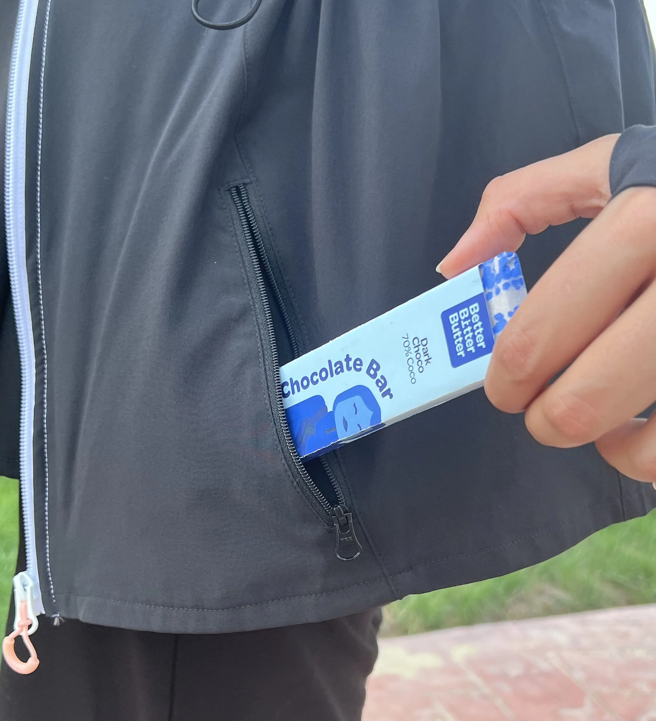
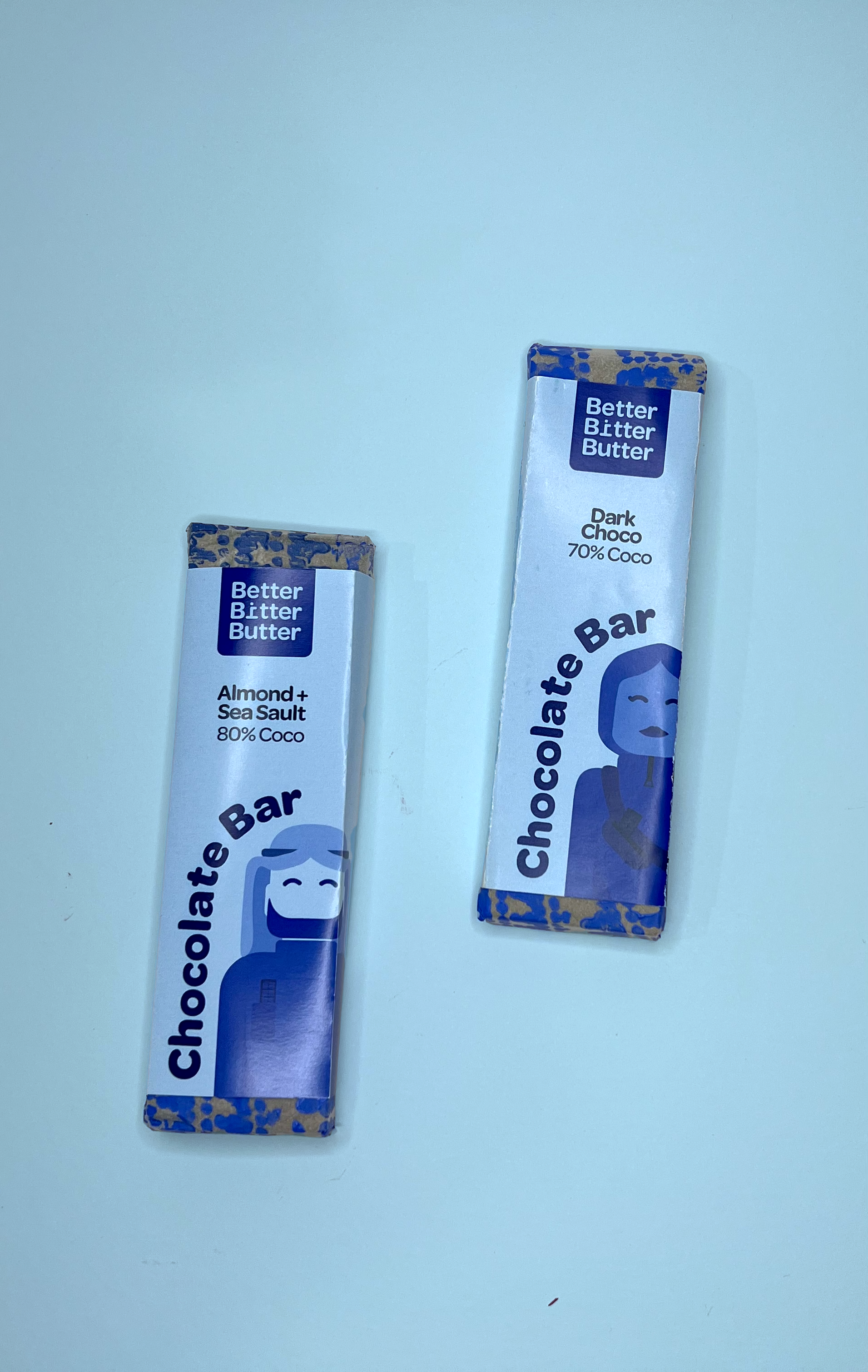
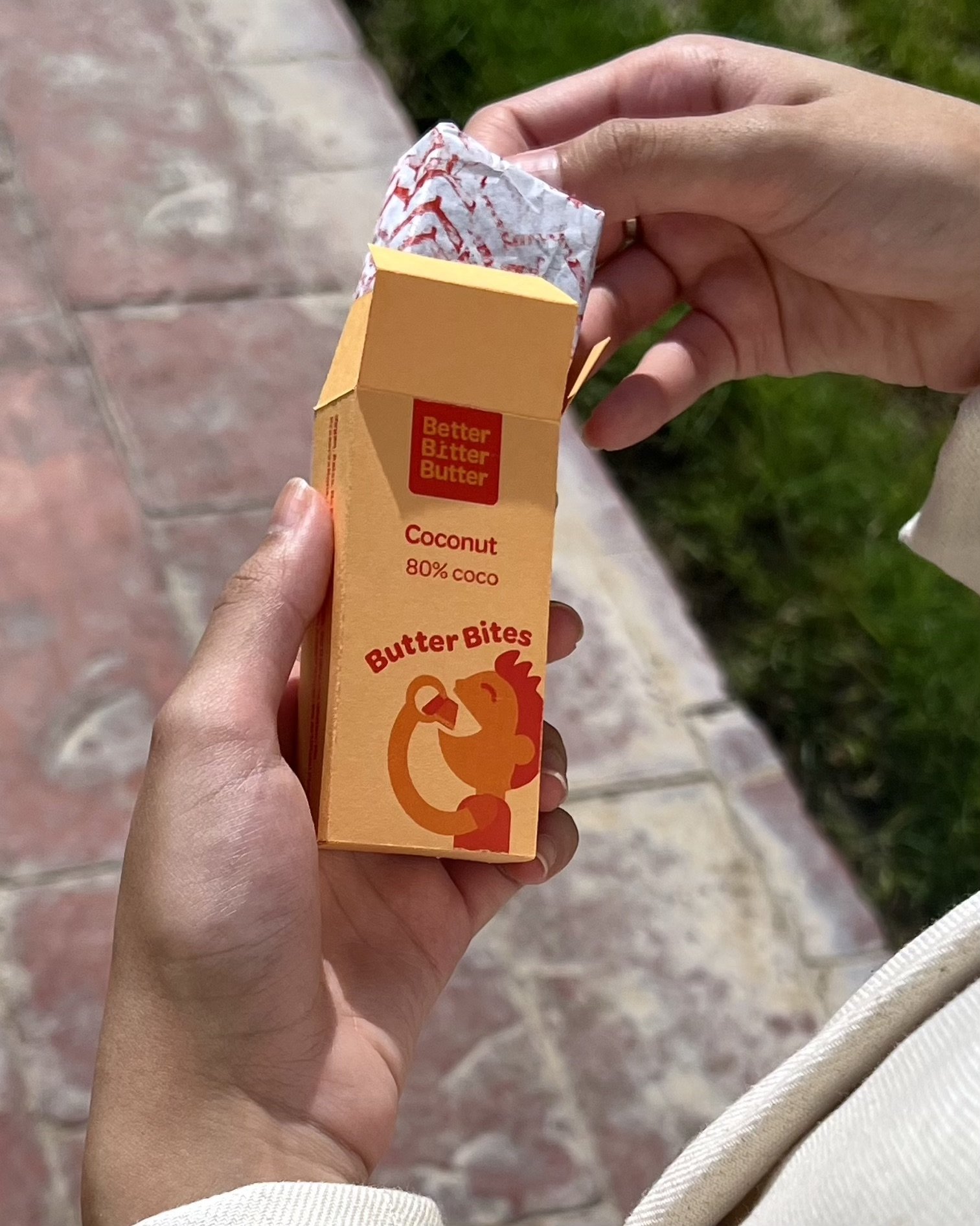
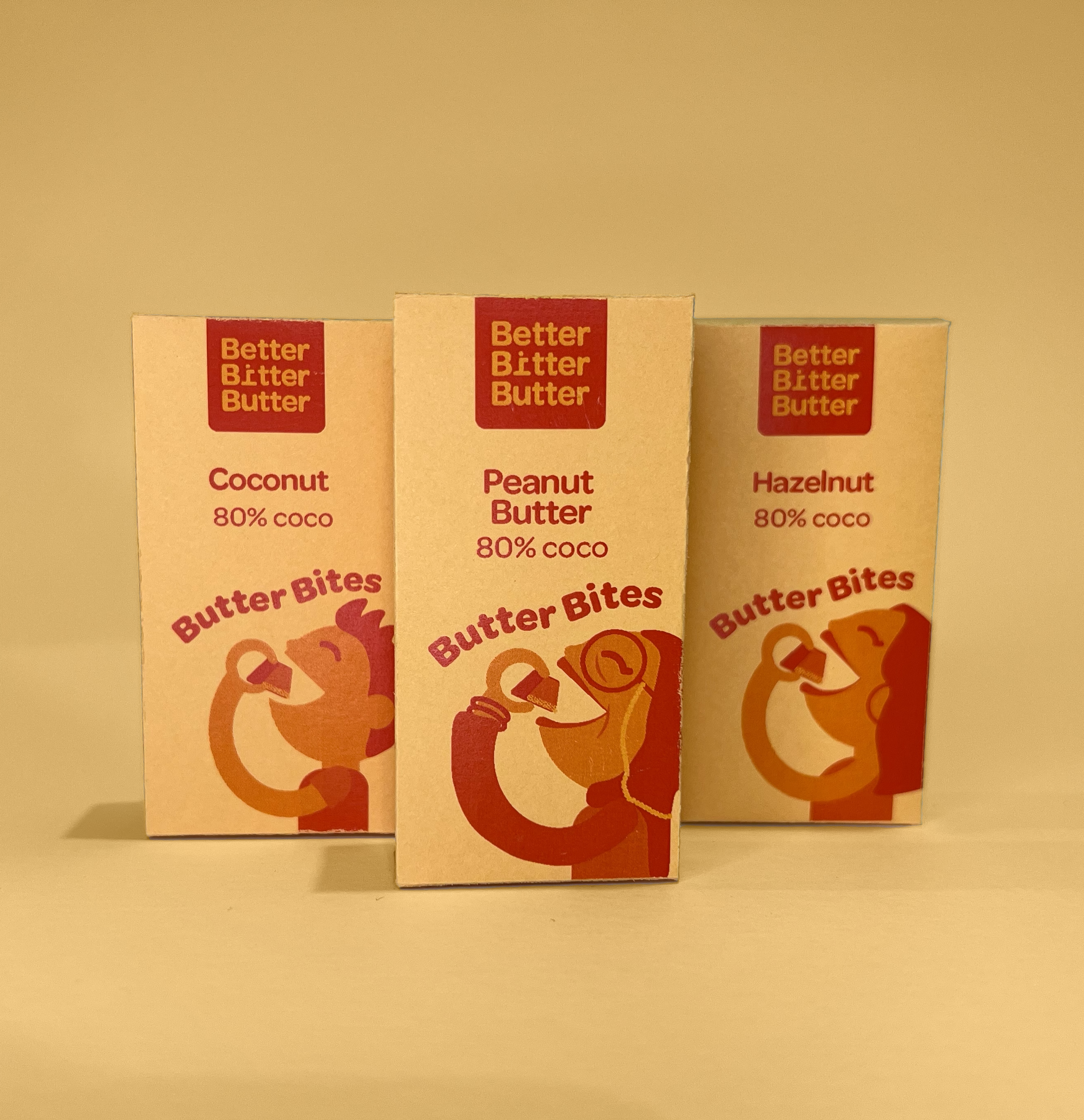
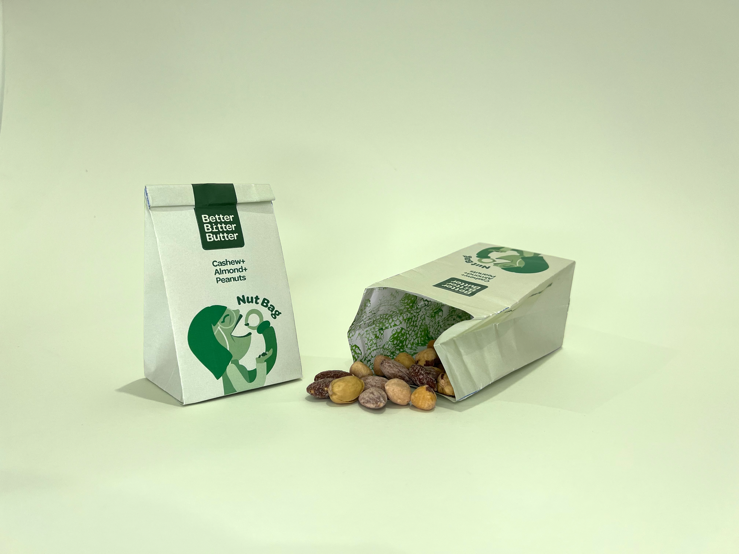
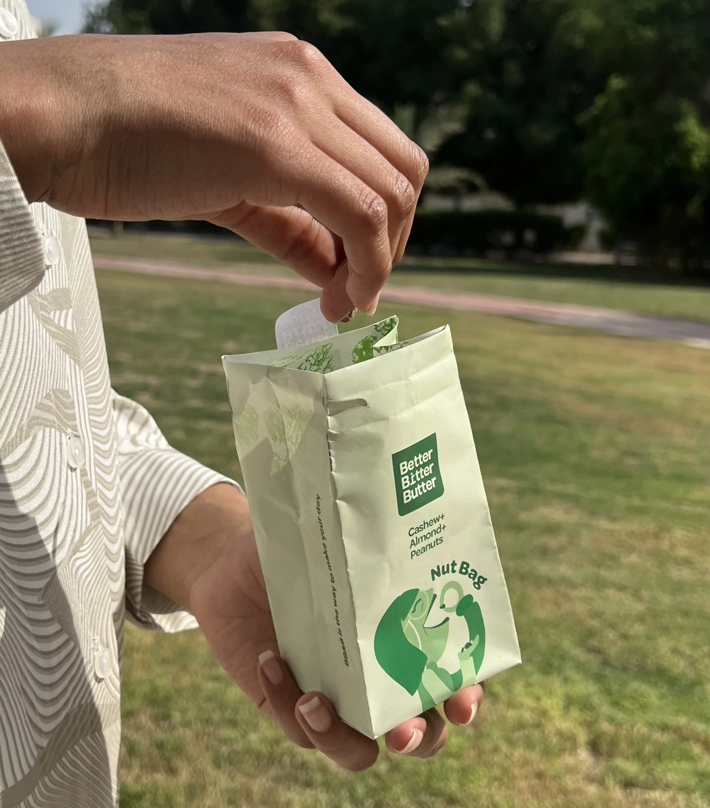
Designing a brand identity for a given client that runs a local healthy chocolate snacks business. The client wanted a fun, on the go, local brand identity that stands out.
Date 26 / 1 / 2022
Category Branding / Package Design
Group Project Marwa AlHadhood / Retaj AlSaeed
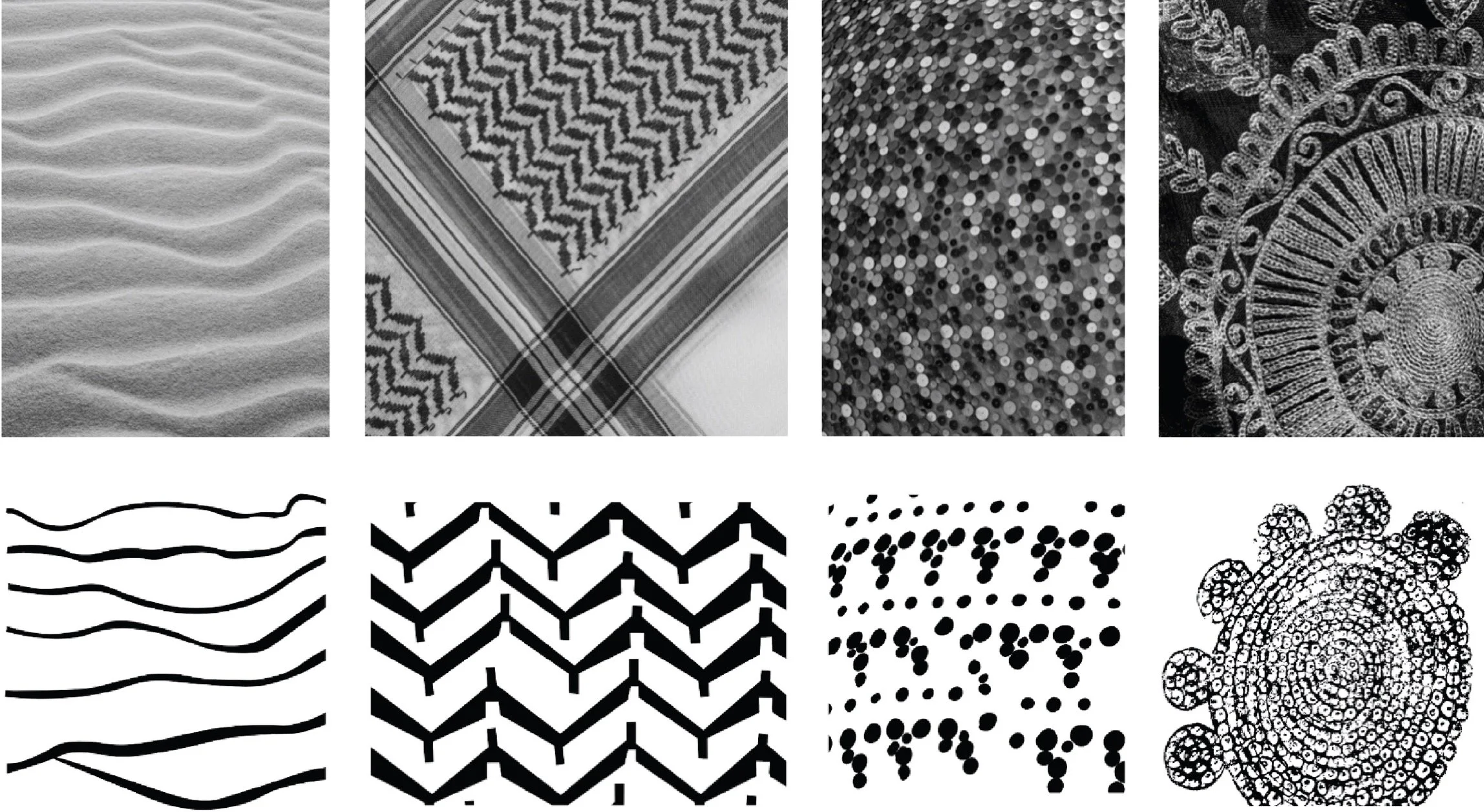
Sand
Headwear
Towers
Thoub
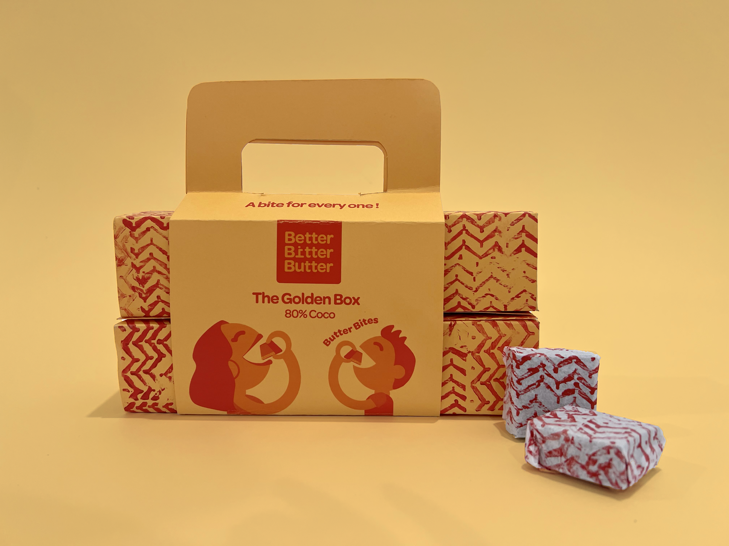
The main inspiration in creating a local identity that is represented in the appearance of the characters. Also, the patterns created are inspired by famous patterns that are known in Kuwait and are part of our identity.
Inspiration
Pattern
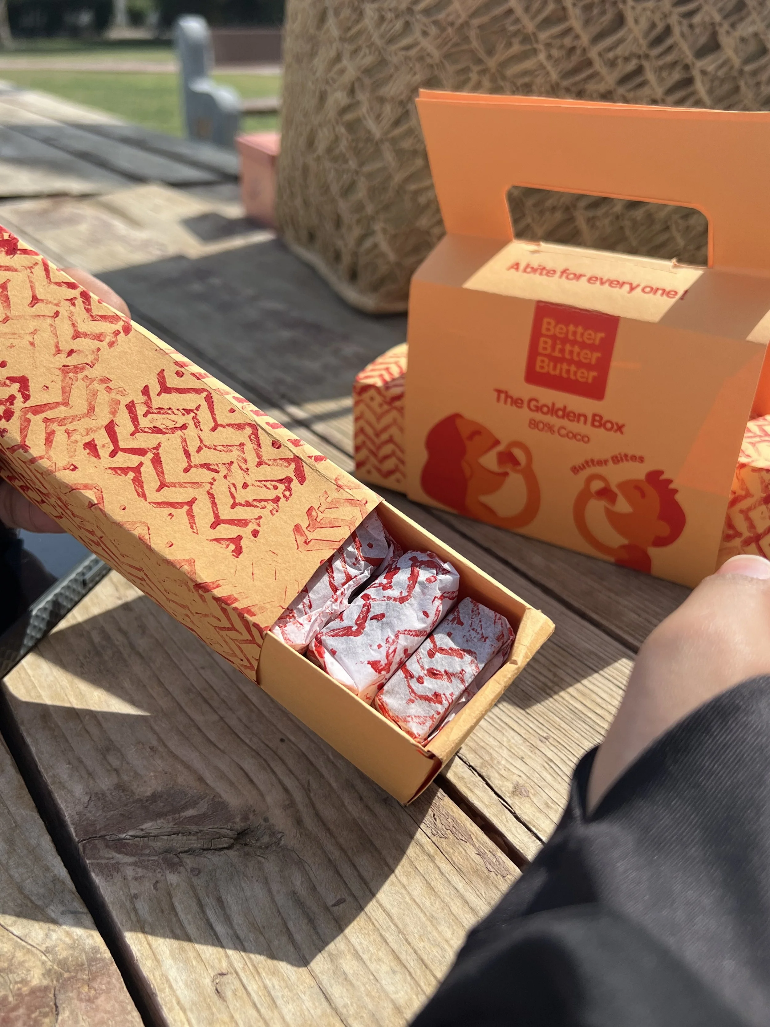
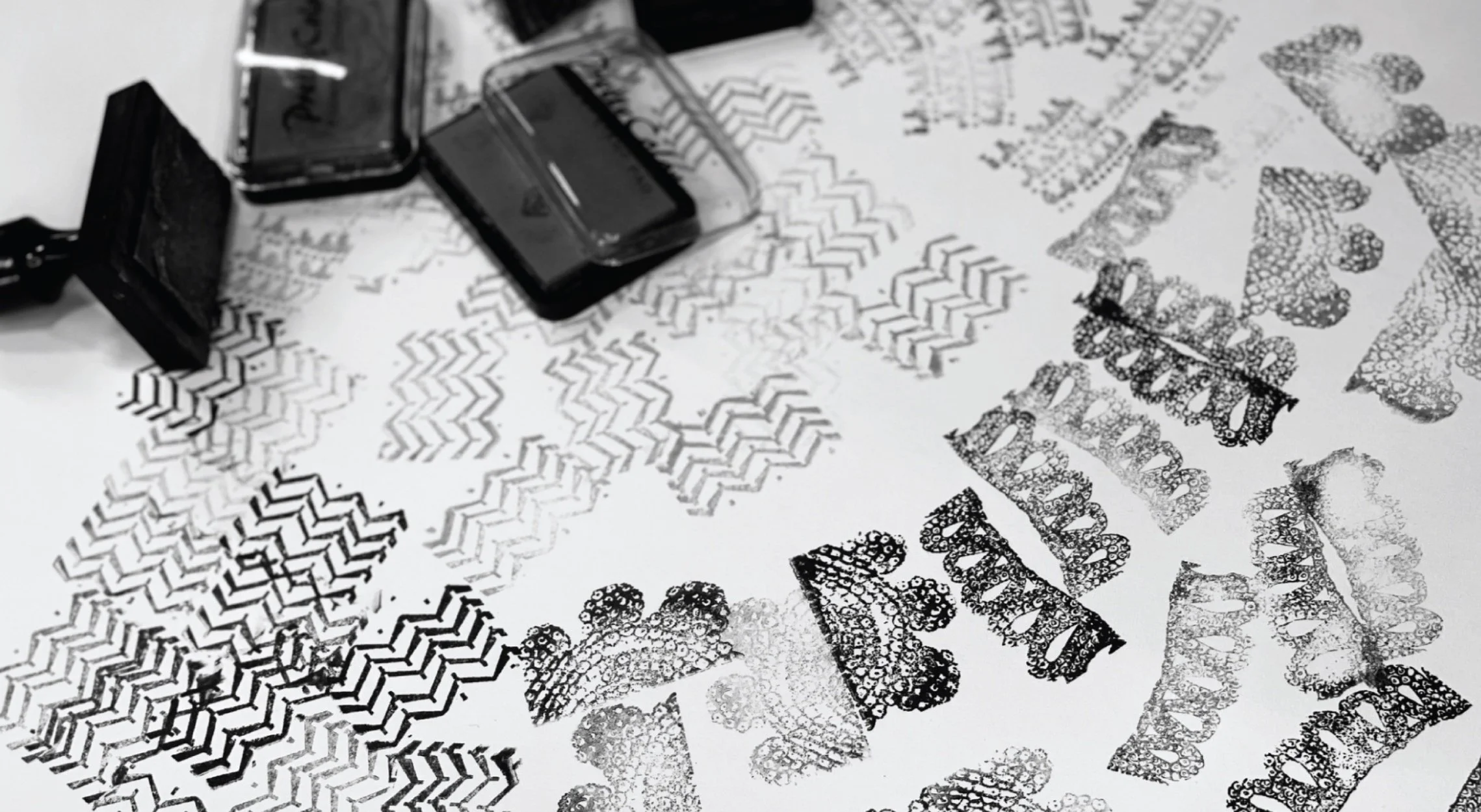
The process of creating the stamps was taking them from familiar textures around us that all Kuwaiti’s relate to. We took these textures and abstracted them into patterns and created stars out of them that we used in the inside parts of the packaging.
Illustrations
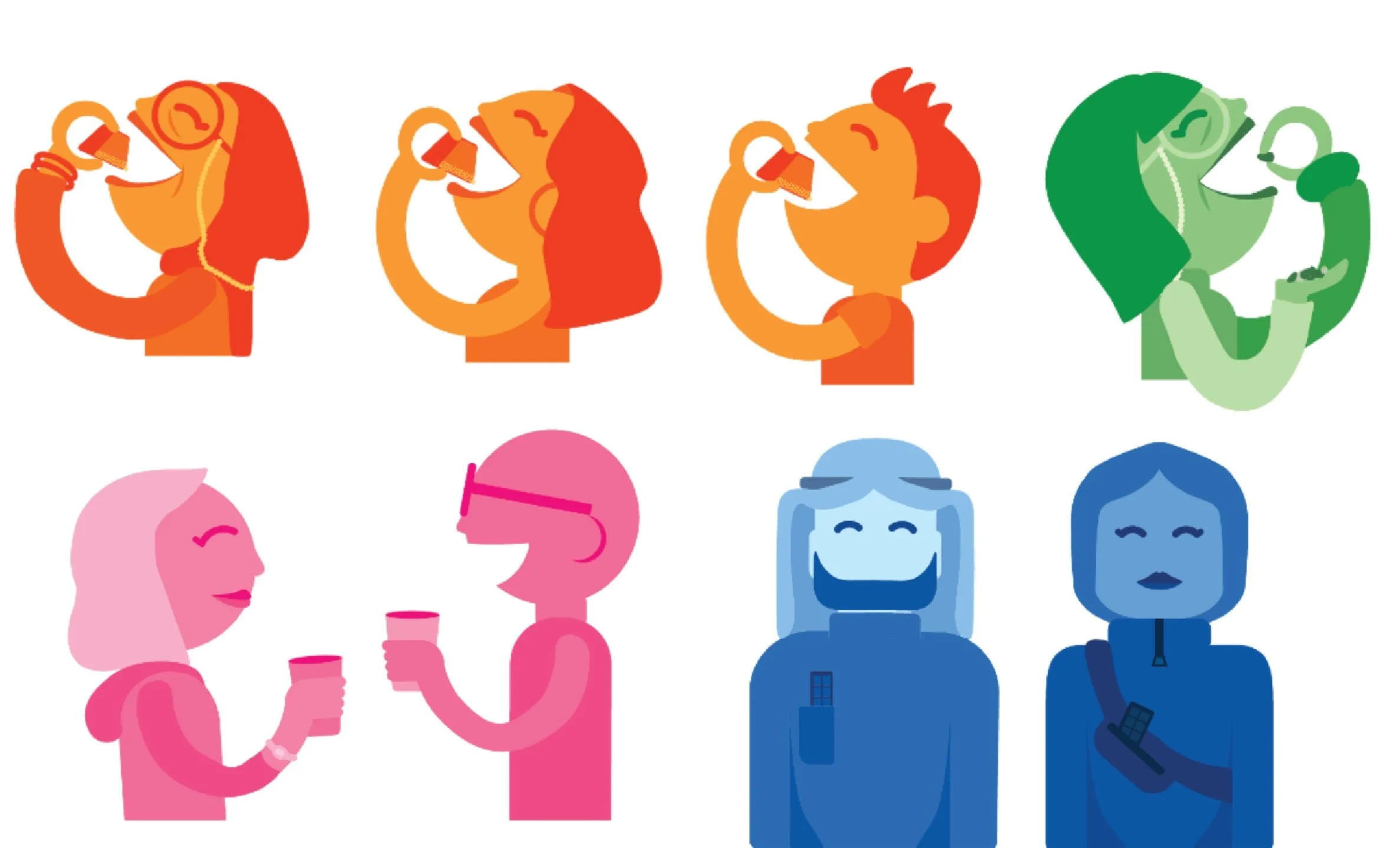
The characters designs were focused on representing people we see in our society, from elders to children. The brands friendliness is represented through the roundness of the character designs.
The characters are bubbly and fun and each one of them has different style, replicating the busy people who need to have chocolate on the go, from gym people, formal people, kids, and generally active people.
